September 1, 2017
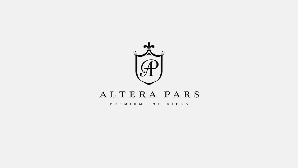
Altera Pars logo
Together with my colleague from Riga we have developed a new logo for the Moscow premium interiors design studio Altera Pars.
Among more than 2300 companies the Altera Pars design studio takes the first place in the Archiprofi (industry magazine) rating of the Russian architectural bureaus. Therefore, the requirements for solving the task – to develop the new, original company logo, were high.
In Latin “altera pars” means “the other way”. Using Latin language in the name of the company refers to the Roman era, which saw the flourishing of art and architecture. So we decided to stylize the name in the classical Roman style that can be seen, for example, on the monuments and plaques with the names of streets in many cities of Italy.
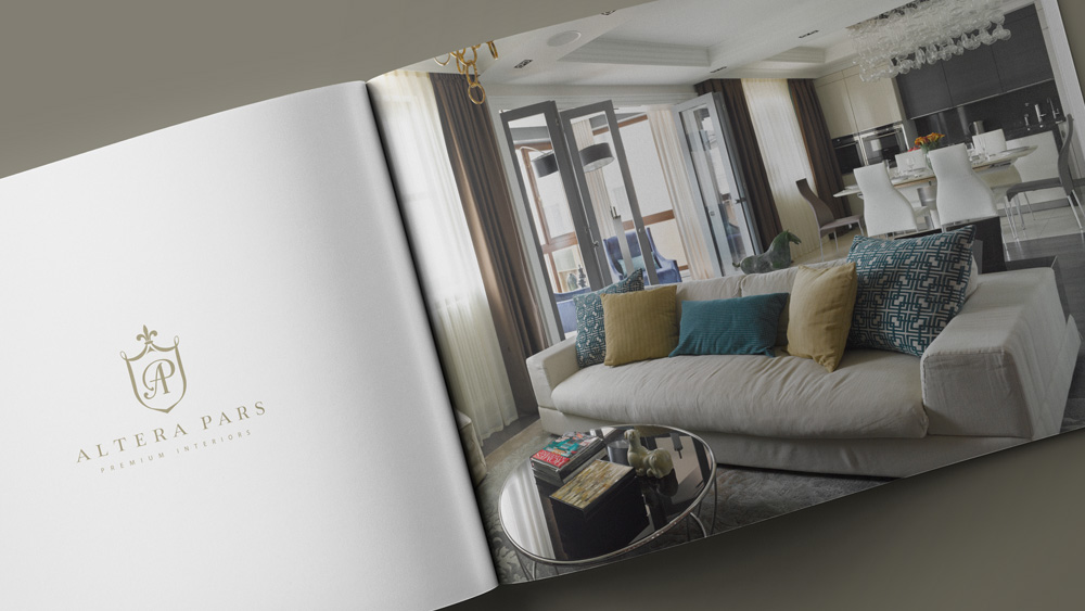
We used only one colour for the logo. Depending on the application of the logo, its colour can be both light and dark tones. On a dark background the logo should look very noble. On a light background, for example, in the booklet next to the photo of one of the Altera Pars interior, it looks bright and presentable:
Simple and creative emblem frames the florid company monogram and it is topped with a heraldic lily, a classical symbol of belonging to the high society. Using the monogram and the emblem were the mandatory requirement from the customer.
