July 31, 2018
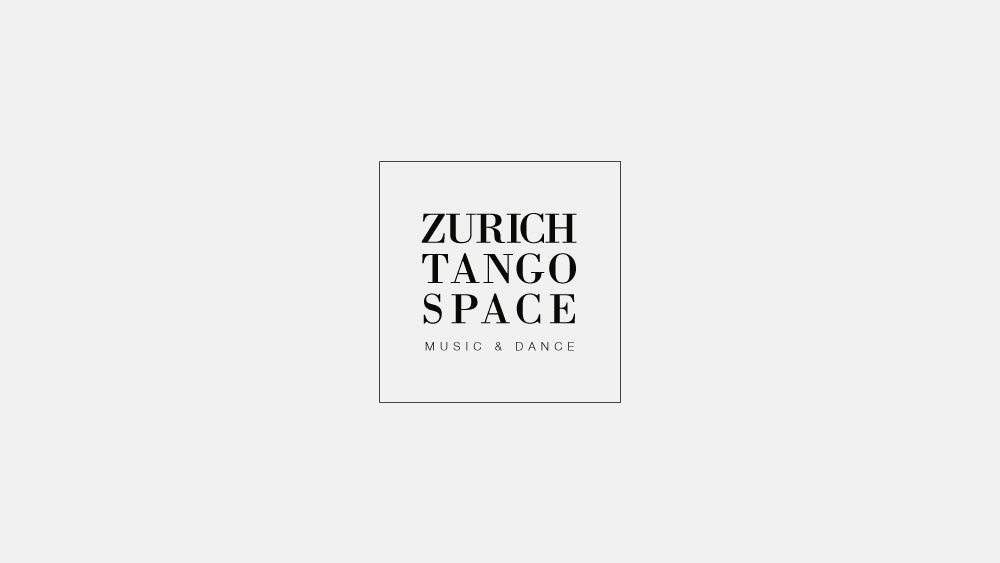
Zurich Tango Space logo
I developed a simple and easy-to-read textual logo for the Zurich Tango Space dancing and music studio.
The client wanted her logo to look familiar and contemporary. She didn’t want to use any graphic symbol in the logo as it might confuse some people. Instead she wanted a clean, easy-to-read typographic logo. Here is the result:
Thanks to the usage of the traditional and quite popular nowadays Bodoni typeface (going back to the 18th century) in the name of the studio, the logo looks familiar. Good distribution of space between the letters makes it easy to read.
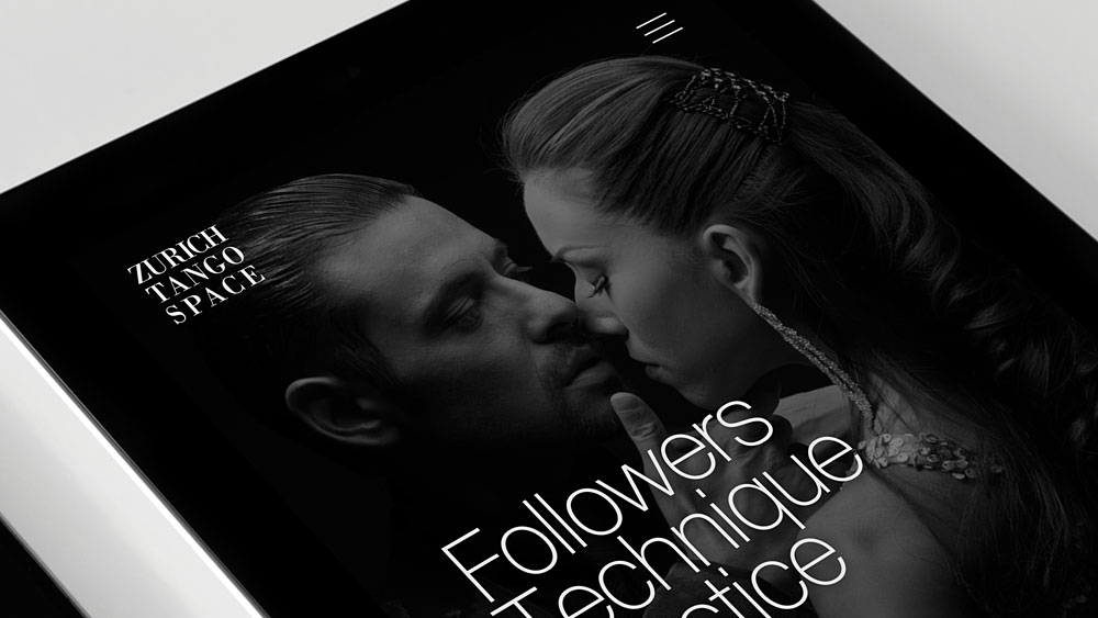
The logo can be used with or without the square frame as well as with or without the “music & dance” descriptor. For example, in the website design I used the logo without both the frame and the descriptor.