August 25, 2017
TJ Travel logo
In cooperation with my colleague from Riga we have developed a new logo for TJ Travel, the company that deals with cruise travel to Russia.
As it often happens, the old company logo went out of date and our task was to update it. The target audience of the company is tourists from Europe and the USA. So we had to develop a simple, stylish and clear logo – in the best traditions of international design.
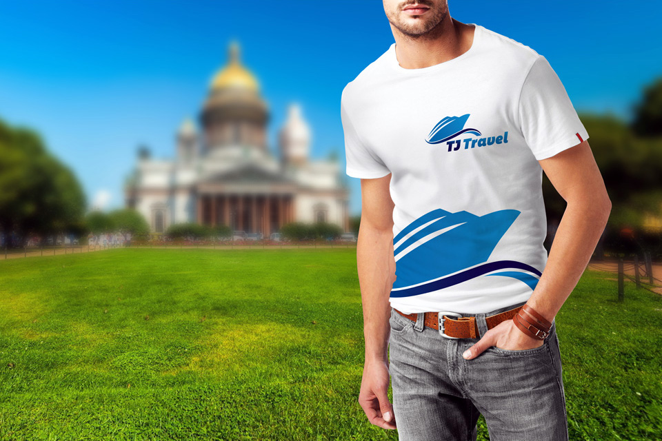
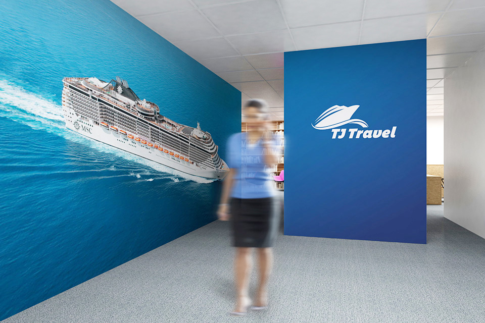
The cruise liner in the symbol of the logo and the company name trigger the associations of cruise tourism. Medium blue colours of the sea water intensify these associations.
Slight slope of the letters creates the feeling of the movement: the liner seems to be floating on waves. The logo design is flat. Shift from volume to flatness is one of the latest trends in graphic design.
One can use a monochrome logo: even that way it will look good against any background.
