May 24, 2017
Concert poster design
Slava Spiridonov, a classical pianist from Zurich, commissioned a poster for his performance event.
The project workflow was highly efficient, since all the text and visual materials were delivered at once. The proposed poster design was immediately accepted by the client, and approved without changes.
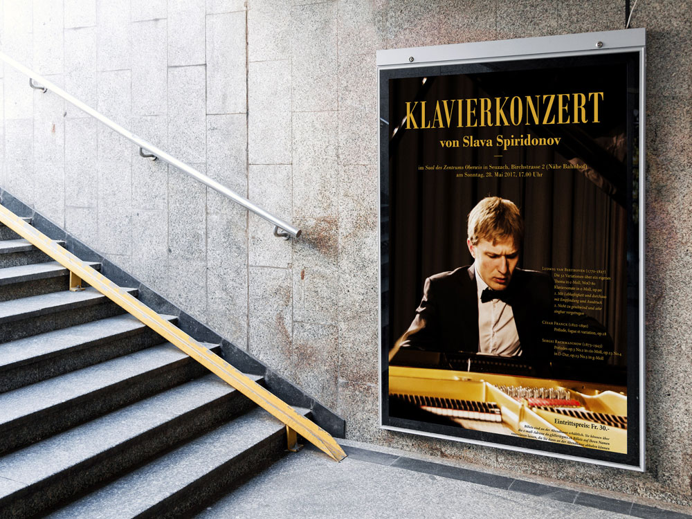
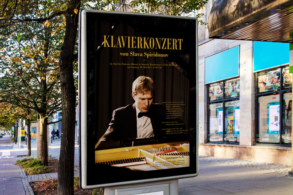
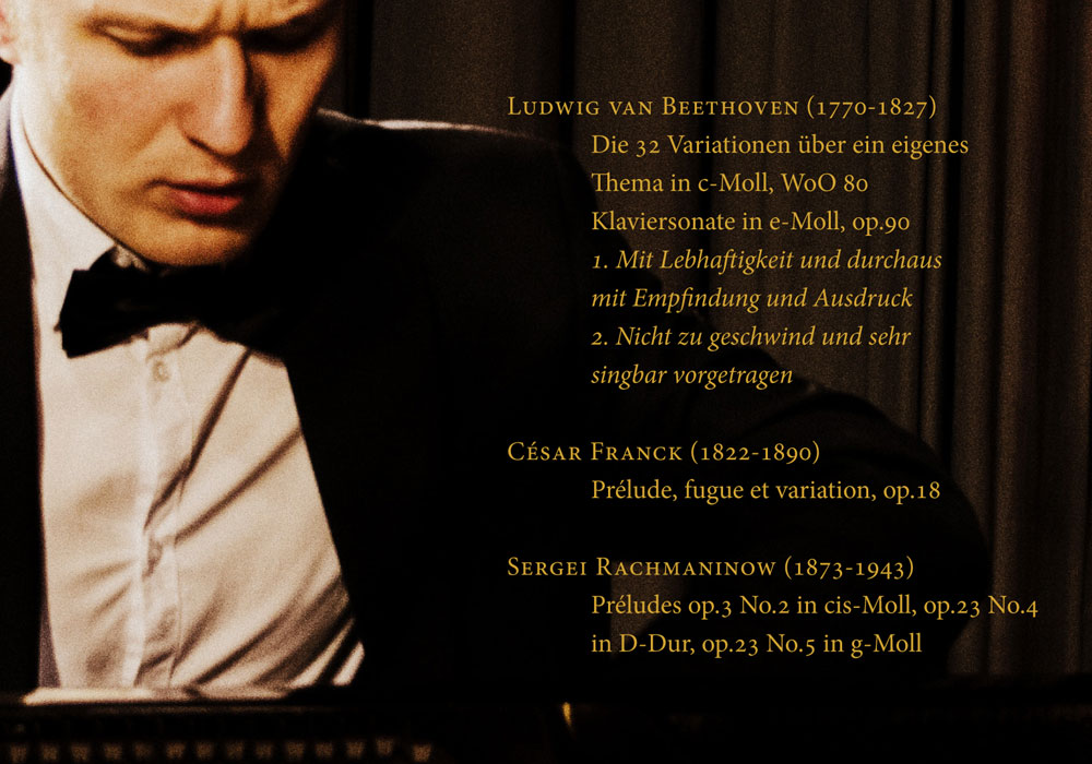
The concert program consisted of music from the 18th and 19th centuries. To emphasize the historical context, I used a font developed in 1767 by the Italian printer Giambattista Bodoni. This font is nowadays a popular part of the established word processors and is named after the developer – “Bodoni”.
The information is presented in a hierarchical order. The title of the event, location and time are displayed in the uppermost part. The concert program in depicted in the center, followed by the ticket reservation options in the lower right corner.
To emphasize the adherence to the time period in the concert programme design, I used the old style text formatting: instead of the common today first line left indent, the first lines of paragraphs are shifted to the left. This is exactly how beginnings of paragraph used to be formatted a few centuries ago.