July 5, 2017
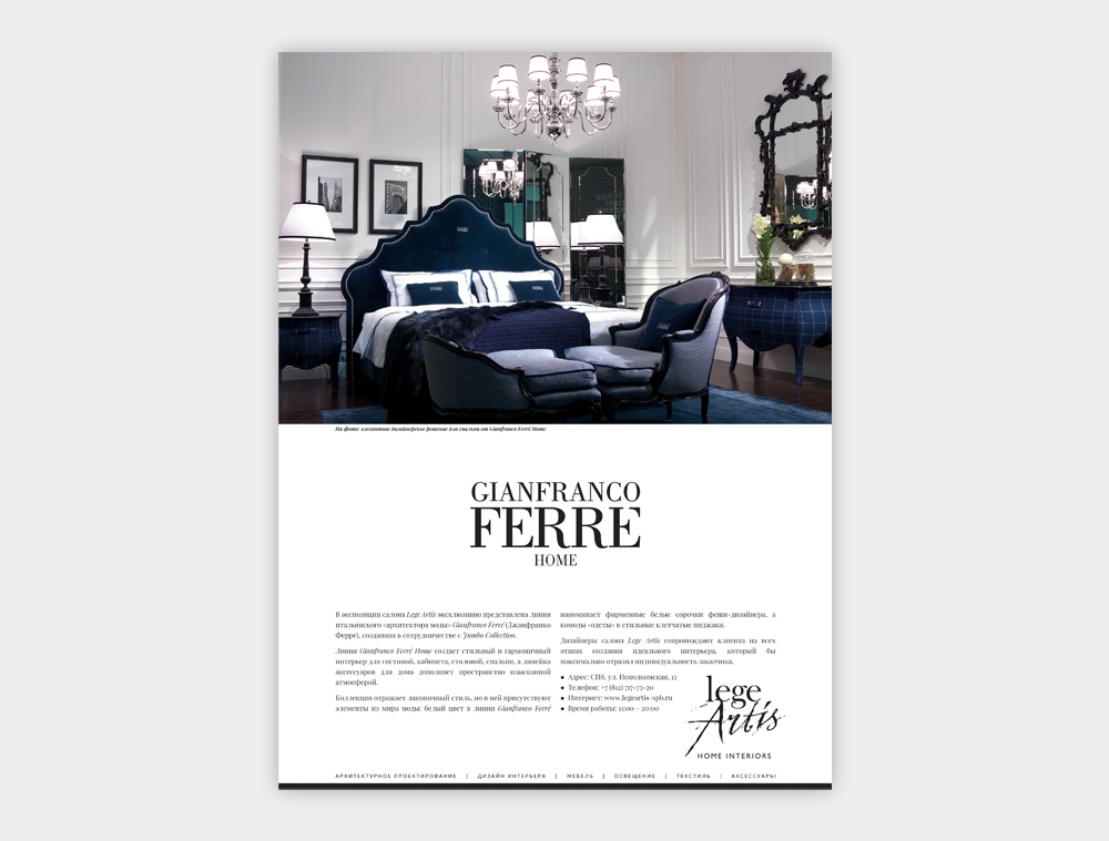
Gianfranco Ferré furniture advertisement
The advertisement of the premium Italian furniture Gianfranco Ferré is designed in the best traditions of the classical school of the print advertising.
A big photo, a lot of white space, a copy made up in two columns for the best readability, a capture beneath the photo, all elements are aligned in accordance with the laws of perception of information… This is exactly how the layouts are designed in the classical school of the print advertising.
In sight of the perception of information, this is the best way to design the layout: it increases the chances of the ad to get noticed and be read by the higher number of potential clients, which can increase sales. In other words, this layout improves the advertising efficiency.
Related works
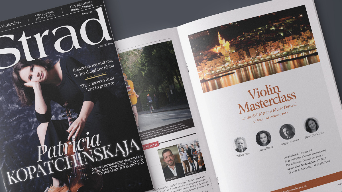
Advertisement for The Strad magazine
I designed the advertisement of the violin masterclass at the Menton Music Festival (Côte d'Azur, France) for The Strad magazine. Read more
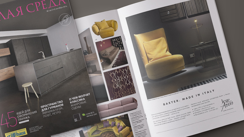
Baxter furniture advertisement
I designed the full-page advertisement of the Italian premium furniture Baxter for the furniture boutique Lege Artis (Saint Petersburg, Russia). Read more

TJ Travel logo
In cooperation with my colleague from Riga we have developed a new logo for TJ Travel, the company that deals with cruise travel to Russia. Read more
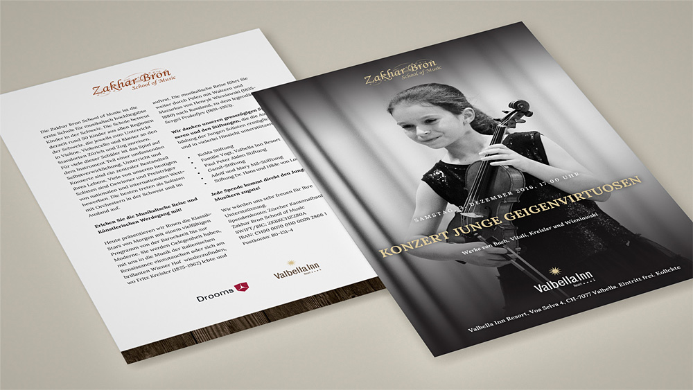
Flyer for a concert in Valbella
A charming flyer design of the "Young Violin Virtuosos" concert that took place at Valbella Inn hotel in the Swiss Alps. Read more